EZ REPORTING
The ‘EZ Reporting’ project emerged from the initiative of Duke Energy’s Transmission Quality Management team. They expressed apprehension about the inadequate submission of Level 3 incident reports by field technicians, engineers, and supervisors. Despite the relatively lower urgency of Level 3 incidents in terms of hazardous events, the lack of documentation had the potential to lead to significant financial losses. Through constructive dialogues with the business unit, we defined explicit objectives for this undertaking. The subsequent sections offer a glimpse into my approach as a user researcher and UX/UI designer.
For a comprehensive view of the EZ Reporting development deck, kindly click on PlantviewEvent.Reporting
BUSINESS & PRODUCT GOALS
STREAMLINE EVENT REPORTING
- Develop a ‘lightweight’ version of the Plantview UI to make it easier for folks to report minor issues and process improvement ideas. Fewer fields and easy code selection
PROMOTE INCREASED REPORTING:
- Encourage higher reporting rates for Low-Level Events, particularly Level 3 incidents
- Emphasize the importance of reporting on seemingly minor issues that hold valuable insights
EFFICIENT INFORMATION MANAGEMENT:
- Simplify and streamline the reporting form for quicker and more accessible use.
- Automatically generate an event in PlantView, akin to the TOMS BOT process, expediting the reporting of low-level events (Level 3) from 72+ hours to 48 hours
SHARE LESSONS LEARNED AND PREVENTATIVE MEASURES:
- Foster a culture that encourages sharing mistakes without punitive consequences.
- Establish a supportive reporting environment that promotes the sharing of lessons learned and preventative measures
DISCOVERY PHASE
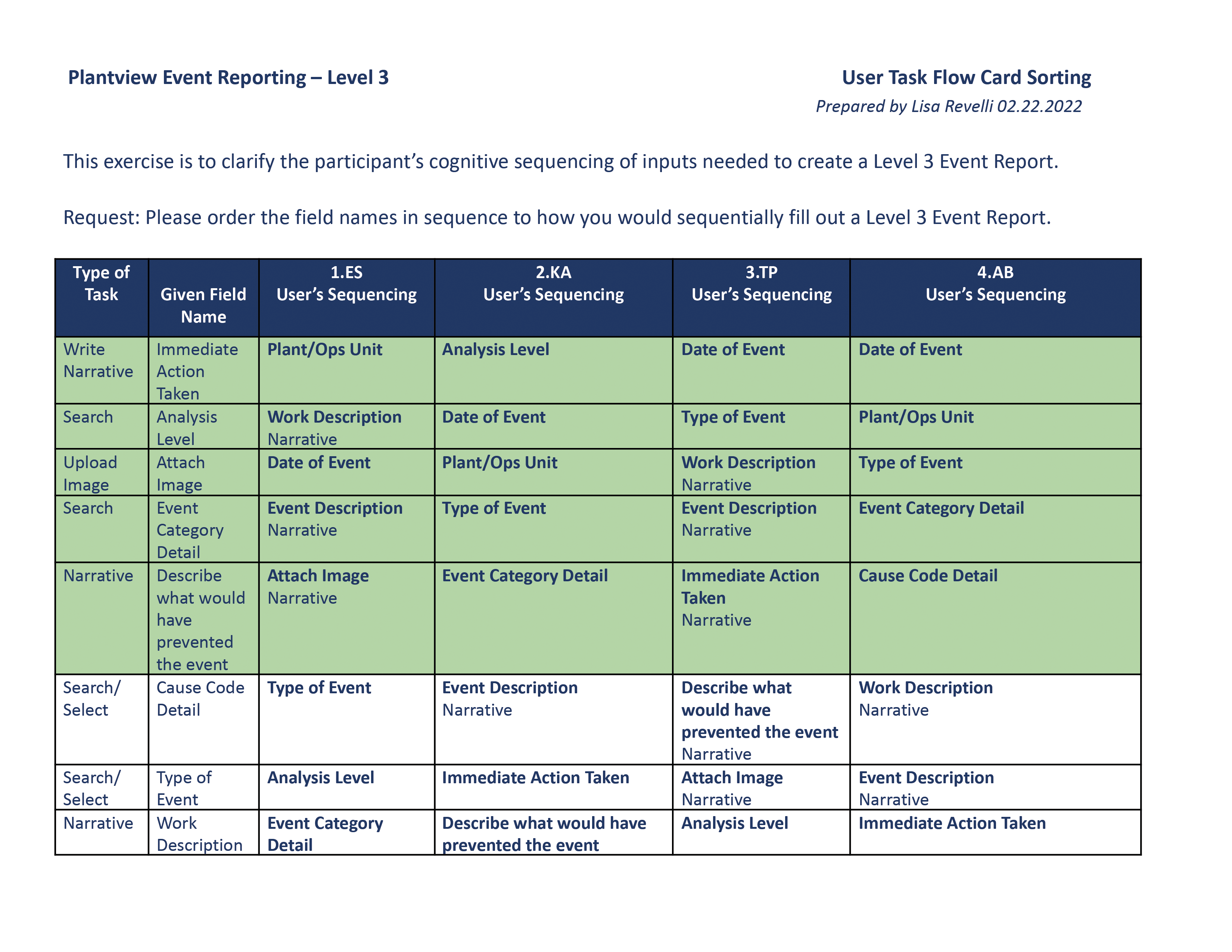
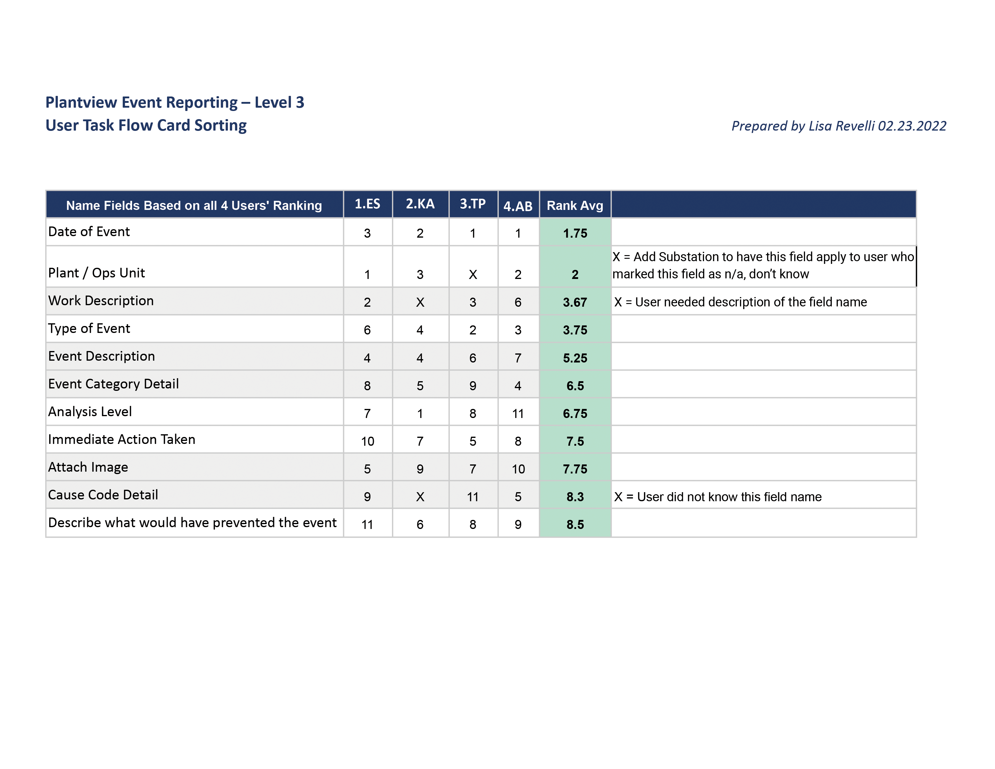
In the initial discovery phase, our agile team, comprising a product owner, solutions architect, two developers, and myself as the lead UX/UI designer, collaboratively worked on developing the framework for the new Level 3 Report. Close collaboration with the solutions architect was instrumental in shaping this framework. Regular engagement with the Manager of Transmission Organizational Effectiveness (TOE), overseeing Event Cause Codes and Transmission Reports, played a pivotal role. Additionally, bi-weekly updates were provided to the Change Manager, ensuring alignment of business goals with stakeholders’ interests. Taking on both the lead UX/UI designer and user researcher roles, I proactively initiated contextual interviews by reaching out to the Change Manager and Manager of Transmissions, given the absence of clear user perspectives for the legacy reporting procedure.
Contextual Interviews
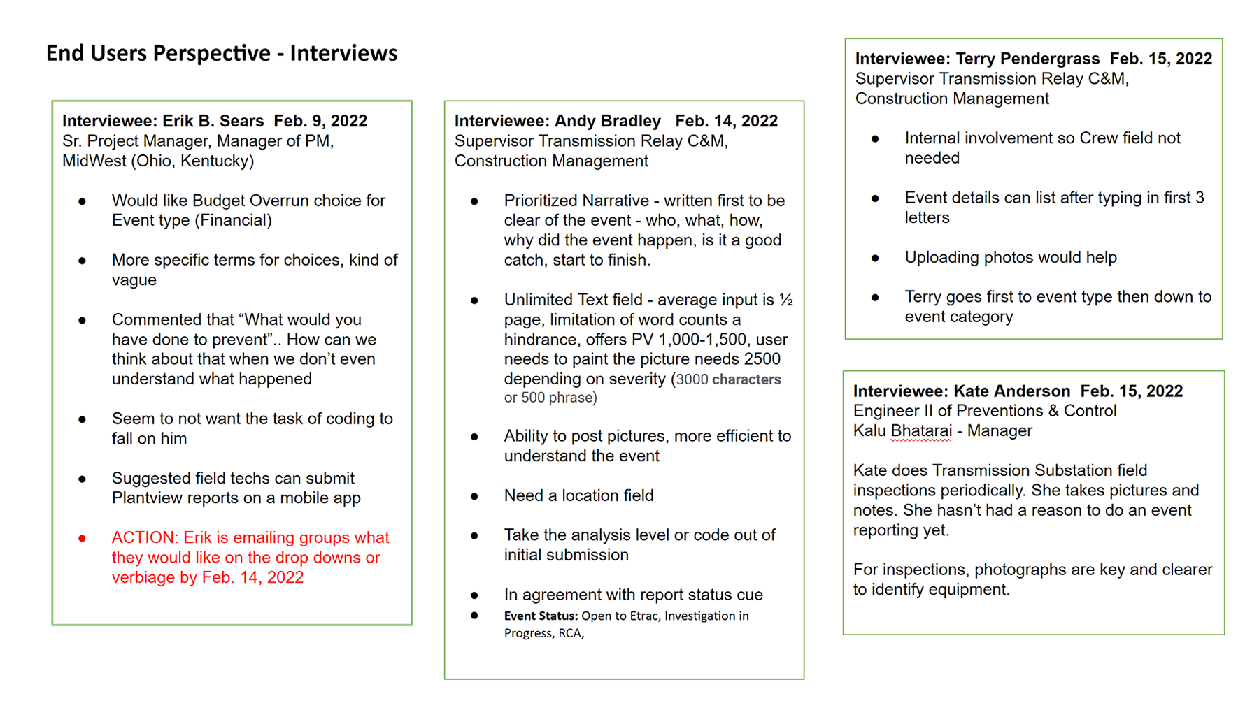
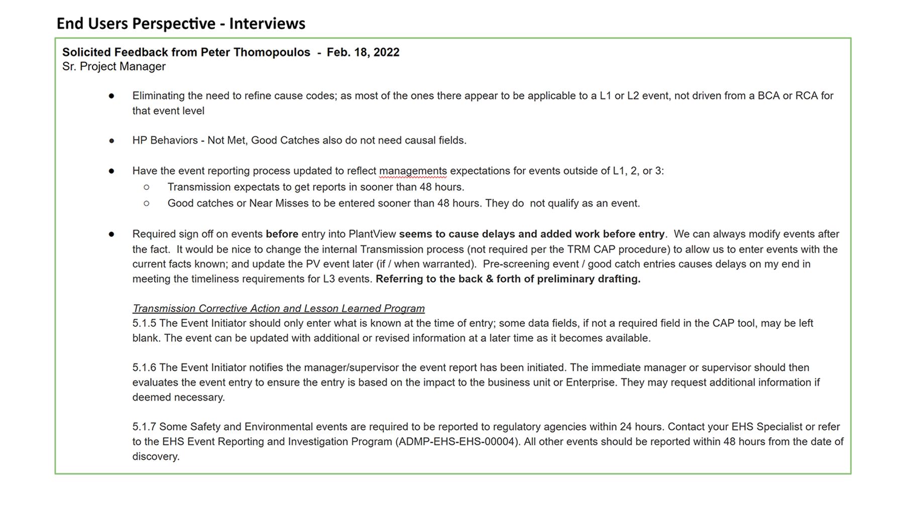
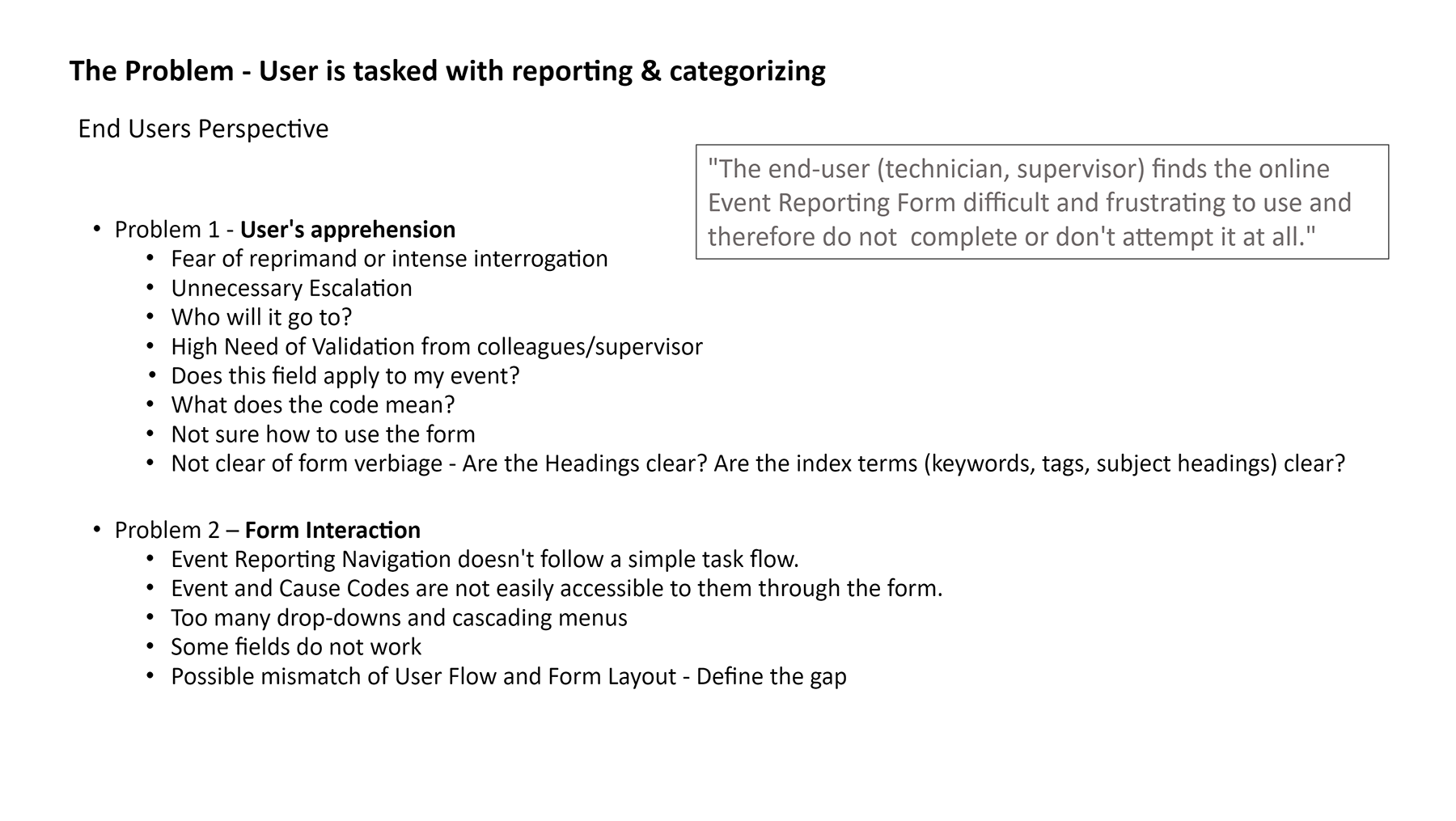
I had the privilege of conducting interviews with five participants, including project managers, supervisors, and engineers. Through their discussions on work processes and current challenges, I identified several areas for potential innovation. Internal interviews were facilitated using Microsoft Teams, allowing for video recordings and transcripts. The subsequent sections provide summaries of the interviewees’ perspectives, sentiments, and key takeaways.
CONTENT SURVEY
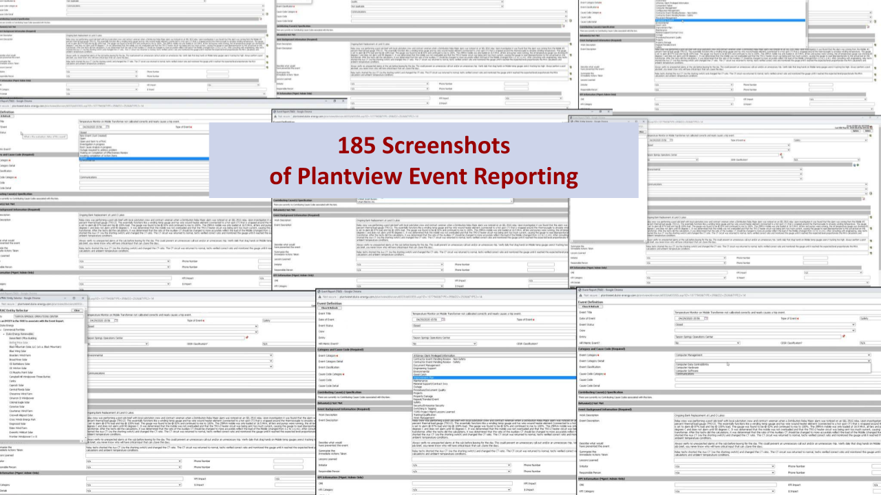
The consensus from the feedback we gathered on the Level 1-3 reporting procedure was unanimous – users found it to be a cumbersome and perplexing process that left them disheartened about completing their reporting tasks. The outdated and irrelevant dropdown lists of event and cause codes within the 30-year-old user interface only compounded this frustration. To gain a comprehensive understanding of this pain point, we conducted an in-depth survey, simulating a real incident scenario. Every step was meticulously documented, capturing a total of 185 call-to-actions necessary to submit an incident report.
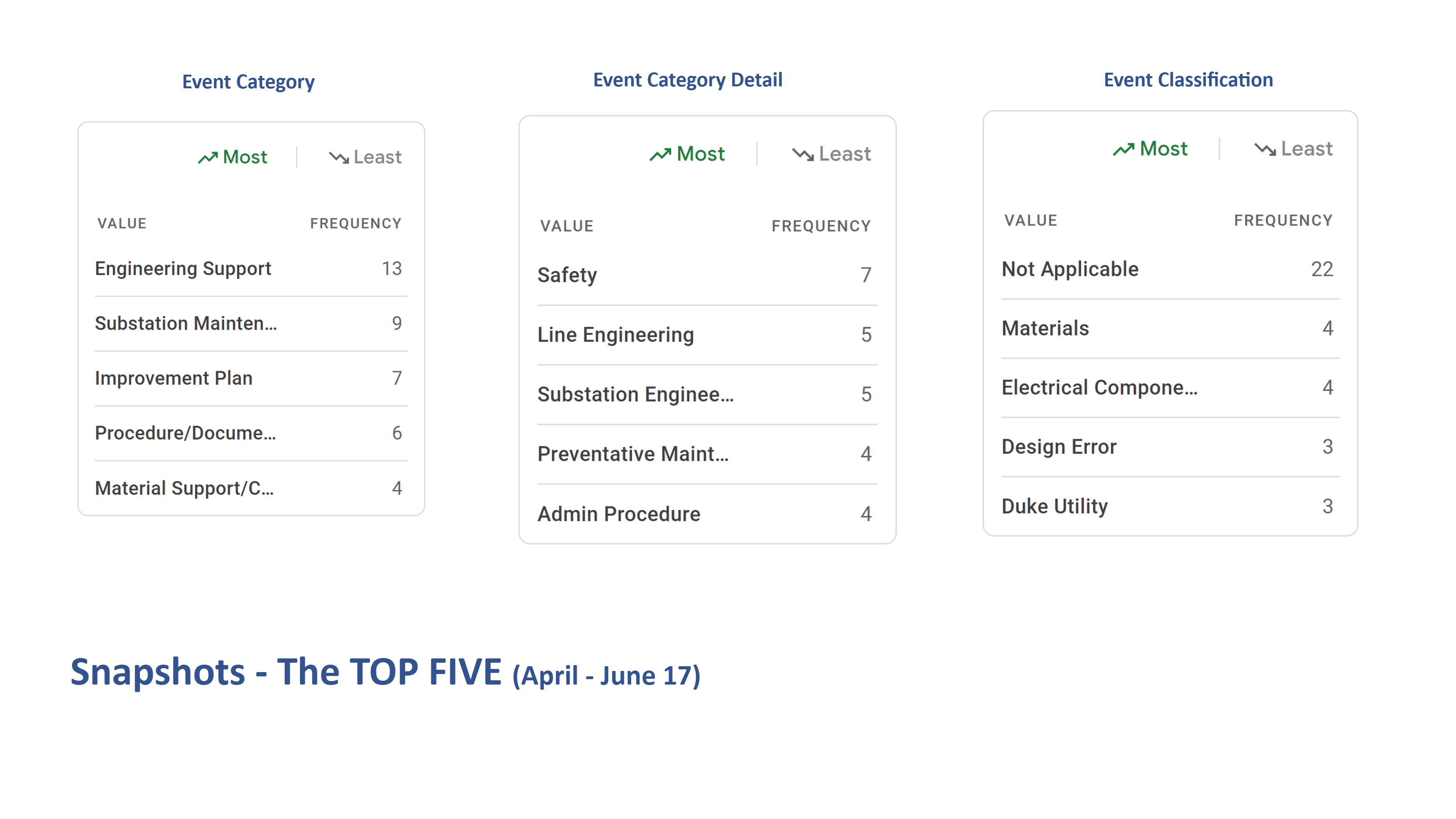
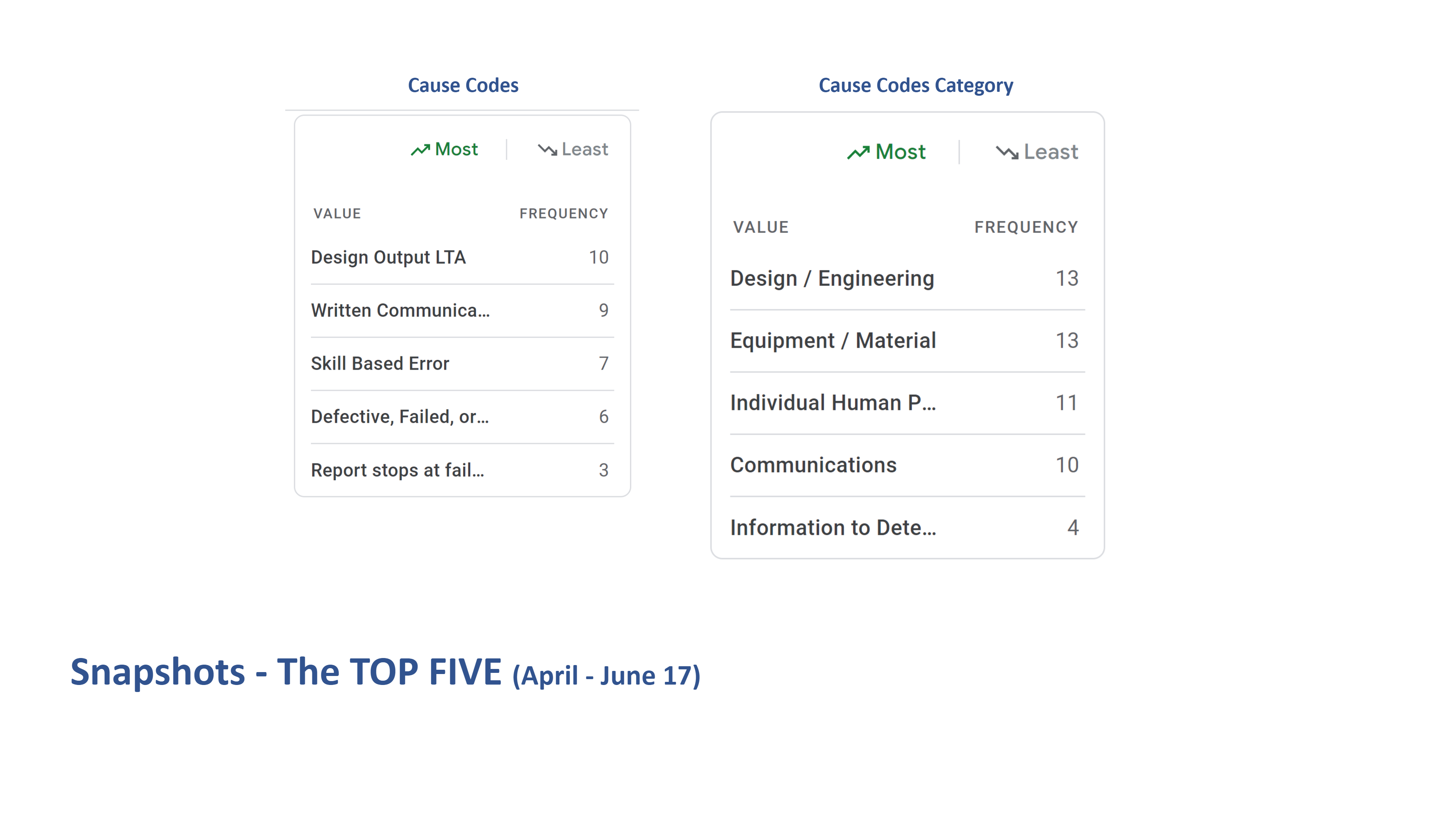
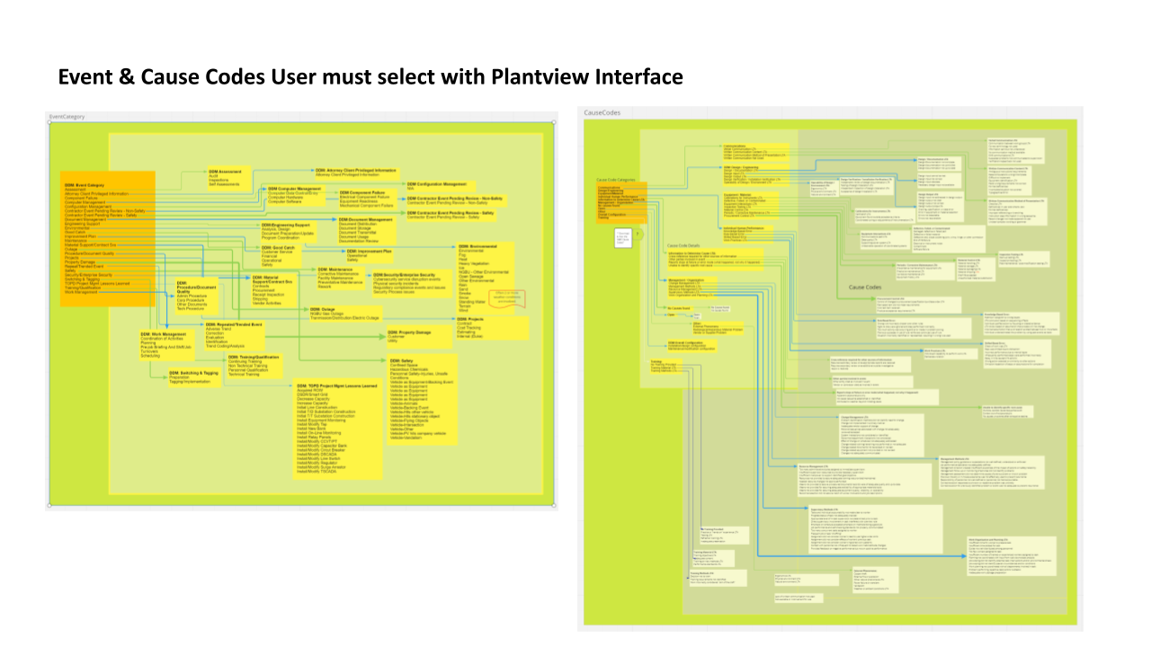
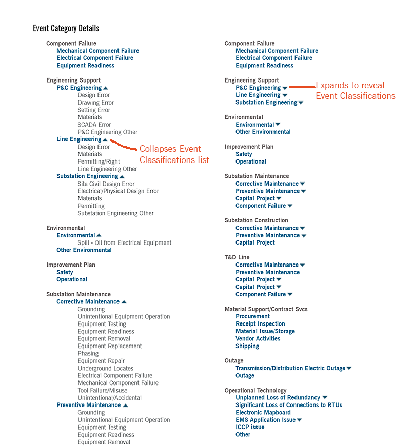
The lack of documentation regarding the relationship between category codes presented a considerable challenge. To overcome this hurdle, I employed Miro, a potent tool that facilitated the creation of a thorough diagram illustrating the Event and Cause codes. This visual representation proved transformative, providing the entire team with a clear understanding of the intricate data structure. Consequently, the Change Manager took proactive measures, successfully reducing the number of codes by an impressive 30%. With this streamlined data, the development team had a robust foundation, greatly enhancing the efficiency of the mapping and interaction process.
DESIGN PHASE
Data Interface Restructuring
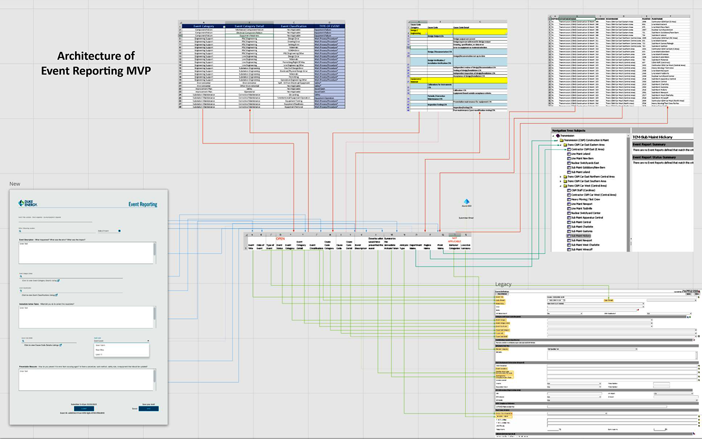
The complete database for various crucial departments at Duke Energy, such as Transmissions and Nuclear, is presently housed on an antiquated third-party platform. Despite the evident intent to migrate from this legacy system, meeting our deadline proved unattainable. As a forward-thinking resolution, we introduced TOMS-BOT, a tool crafted to streamline the extraction process for our application. This enhancement empowered us to operate with increased agility and efficiency when adjusting or expanding our model.
USER EXPERIENCE / USER INTERFACE DESIGN
Form Features
The initial iteration of our EZ form incorporated an image upload feature, enabling users to visually document incidents. This feature garnered enthusiastic feedback from 75% of our users, highlighting its practicality. Nevertheless, after thorough deliberation, we opted to remove this feature owing to challenges associated with developing a backend repository for the images. Subsequently, I embarked on designing interactive prototypes for various versions of the EZ form using Figma.

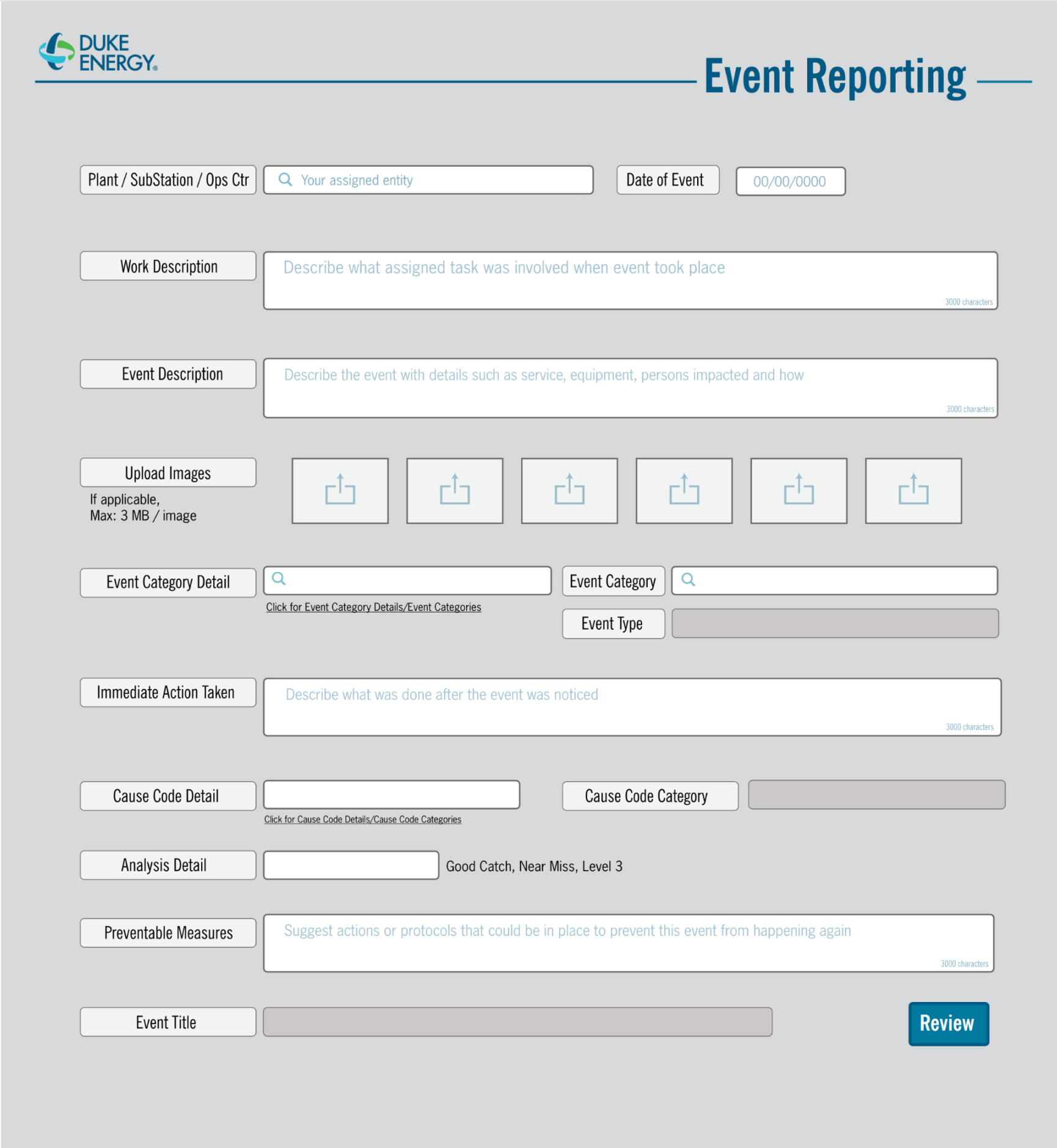
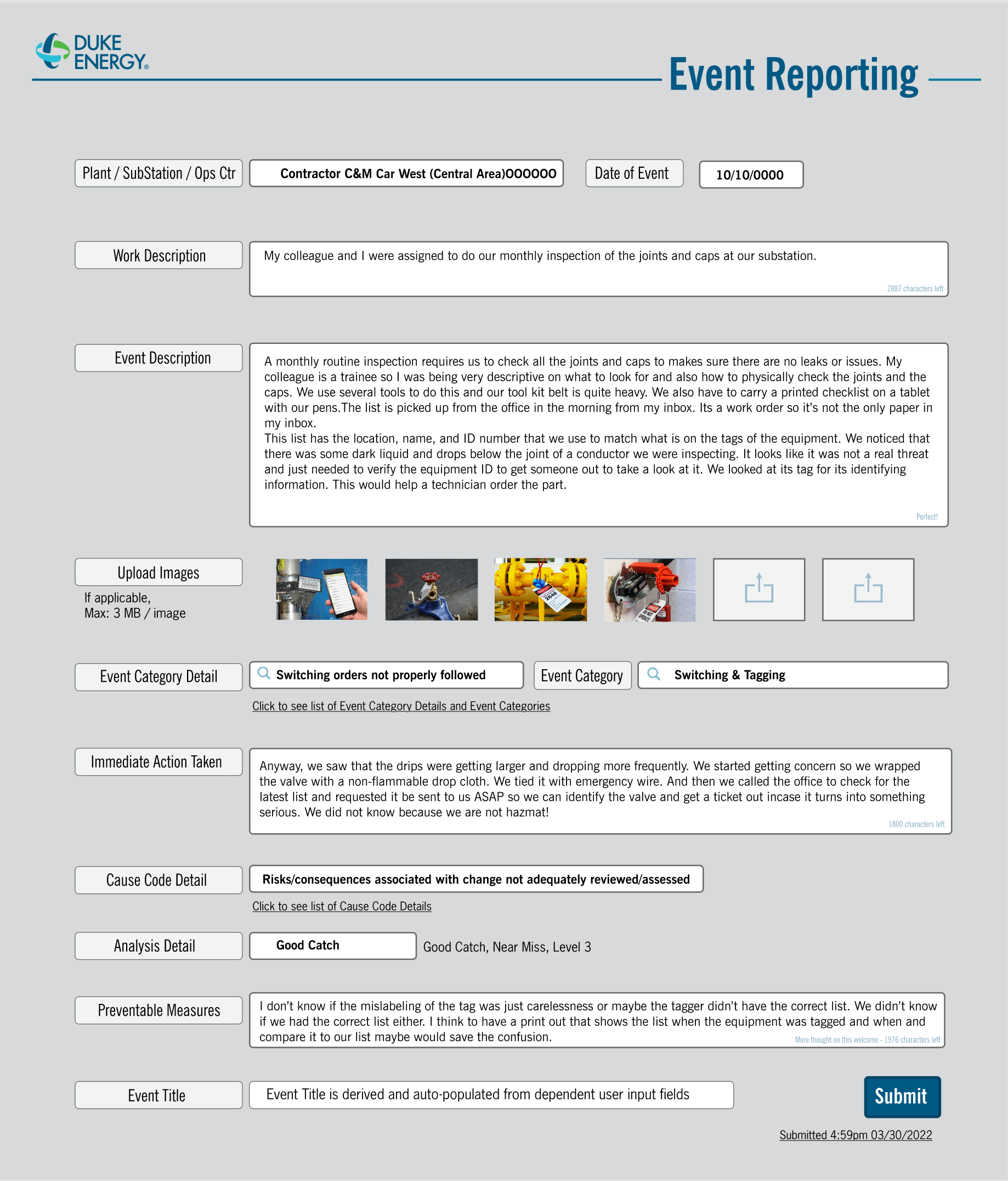
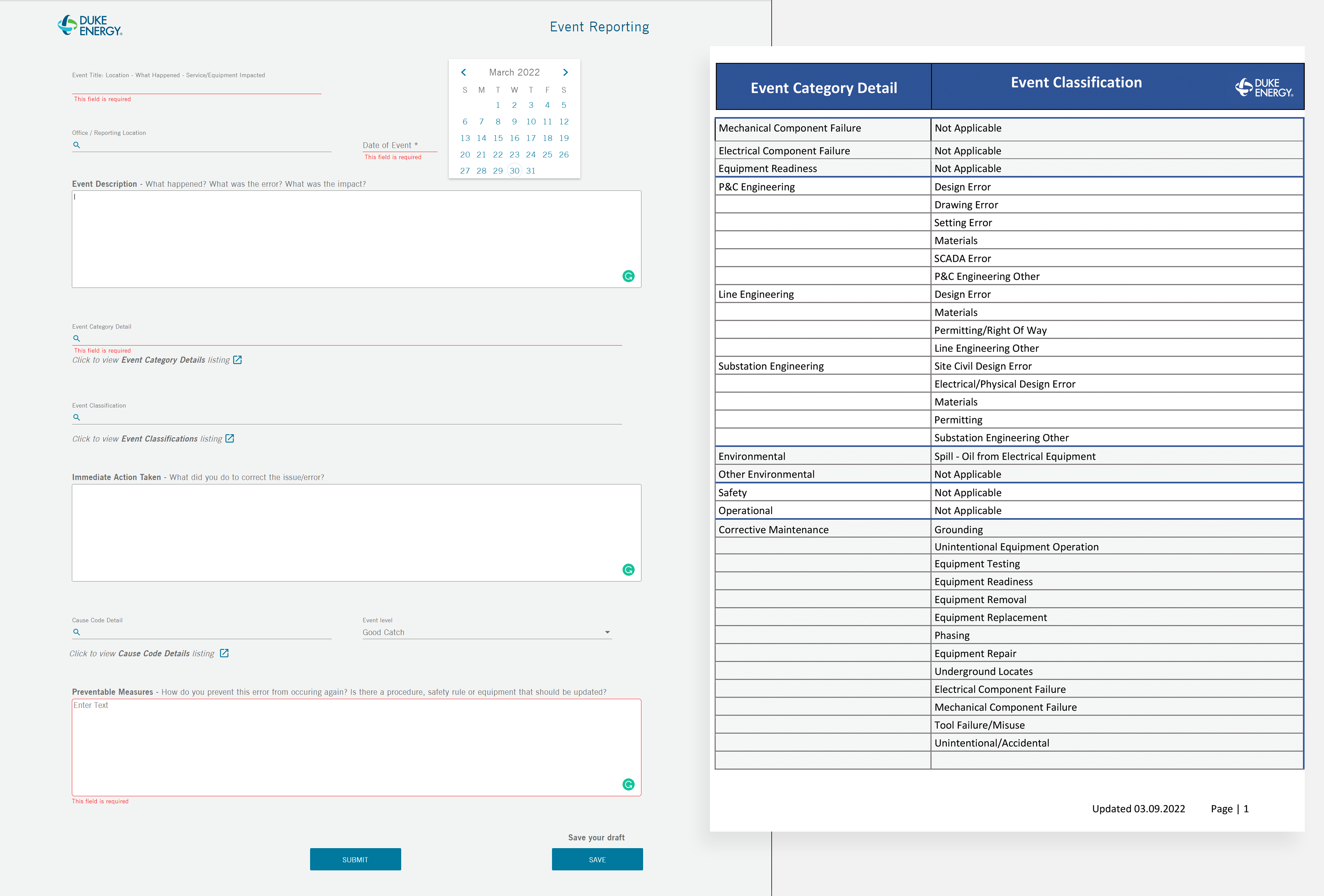
Iteration 3 – In the third iteration, presenting the codes visibly while users worked on the reports proved to be highly user-friendly. To further enhance the user experience (UX), I suggested incorporating an expandable column that displayed all the codes and their hierarchies. This feature allowed users to navigate the code listing effortlessly using arrow keys, facilitating easy access to the required information. Alternatively, users could type three letters of a code in the text field, prompting a predictive search that displayed relevant codes for selection. Iteration 3 ultimately evolved into the final design for the interactive incident report form.
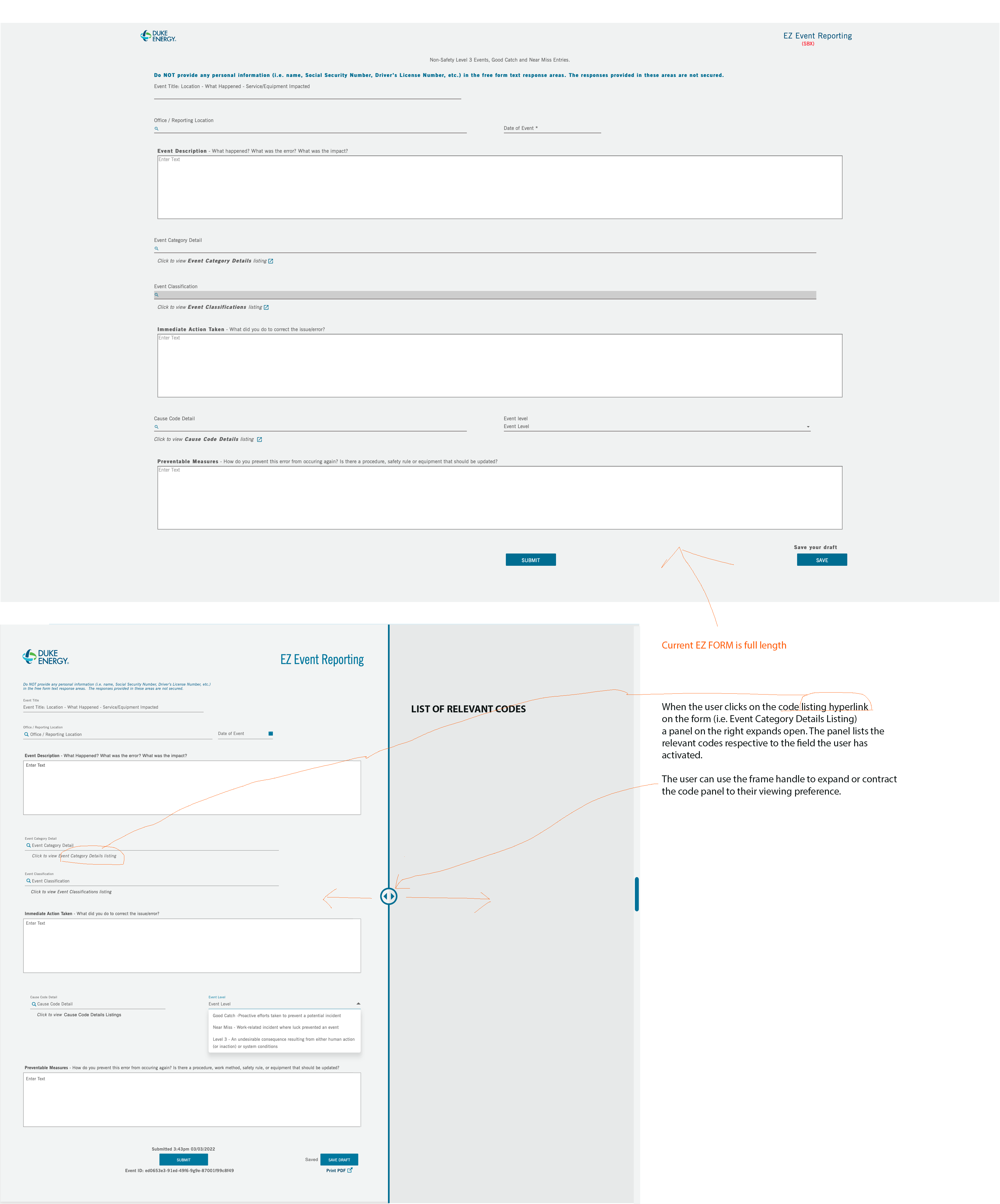
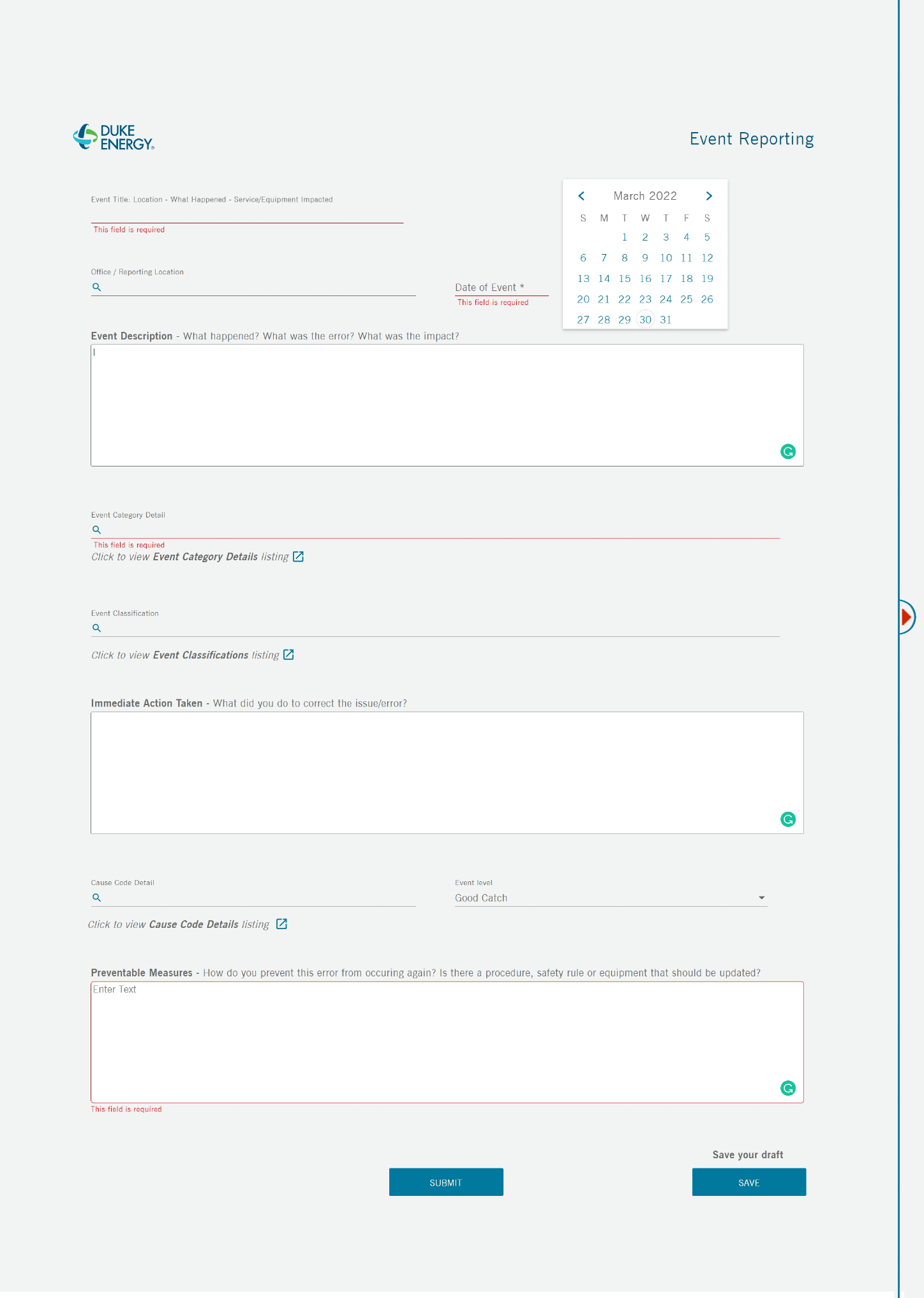
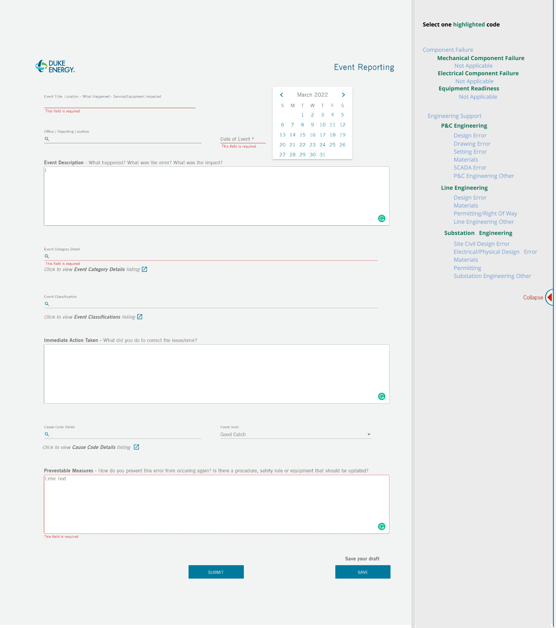
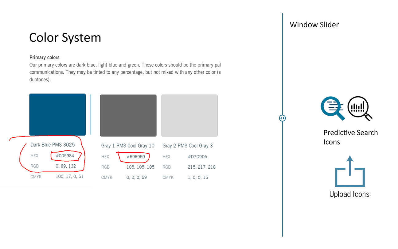
UI Graphics – Adhering to the Duke Energy design standards was paramount in terms of font, font size, and color. If granted additional flexibility, I would have strongly recommended implementing graphical enhancements to better serve the users.
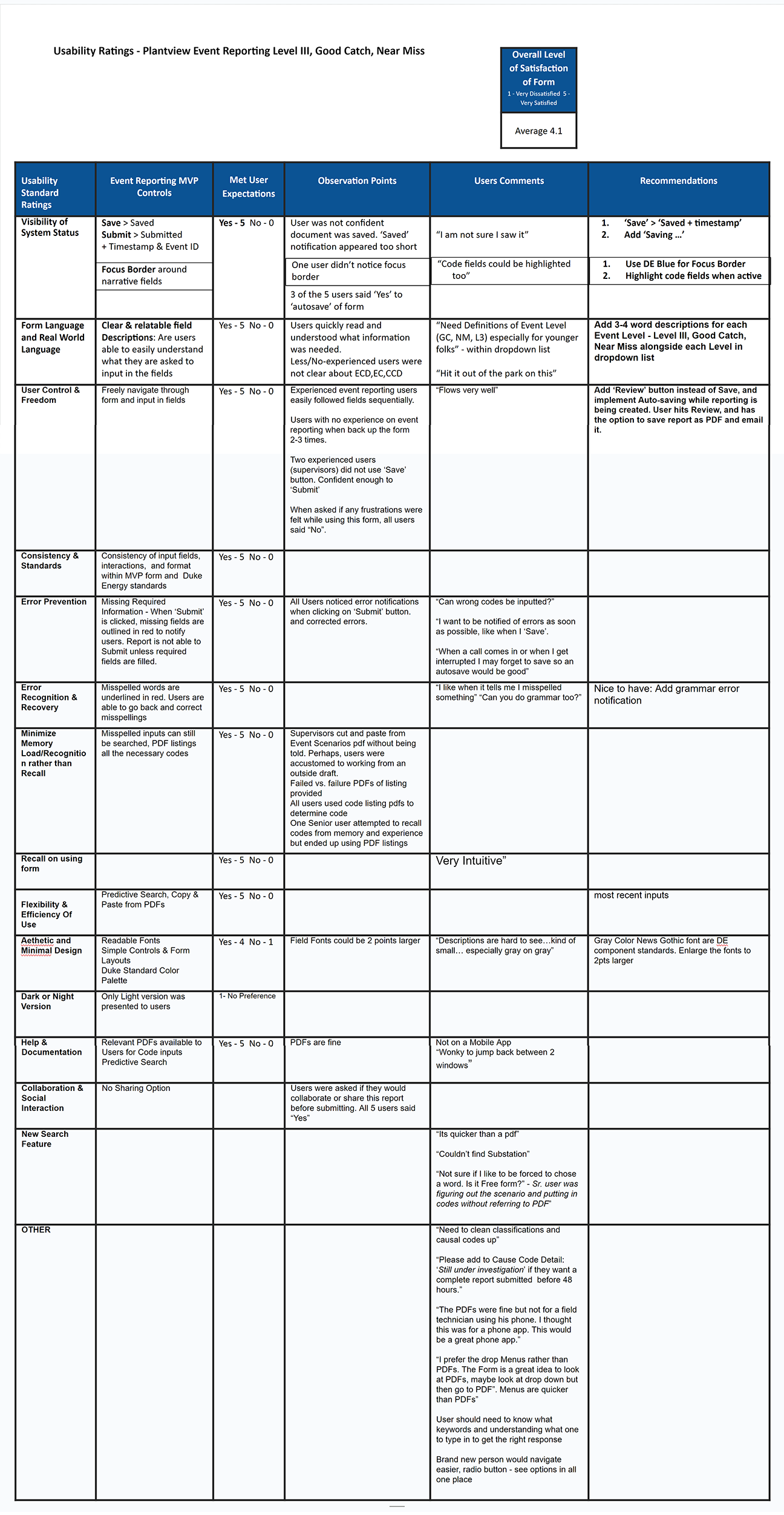
USABILITY TESTING – VALIDATION

USER INCENTIVE
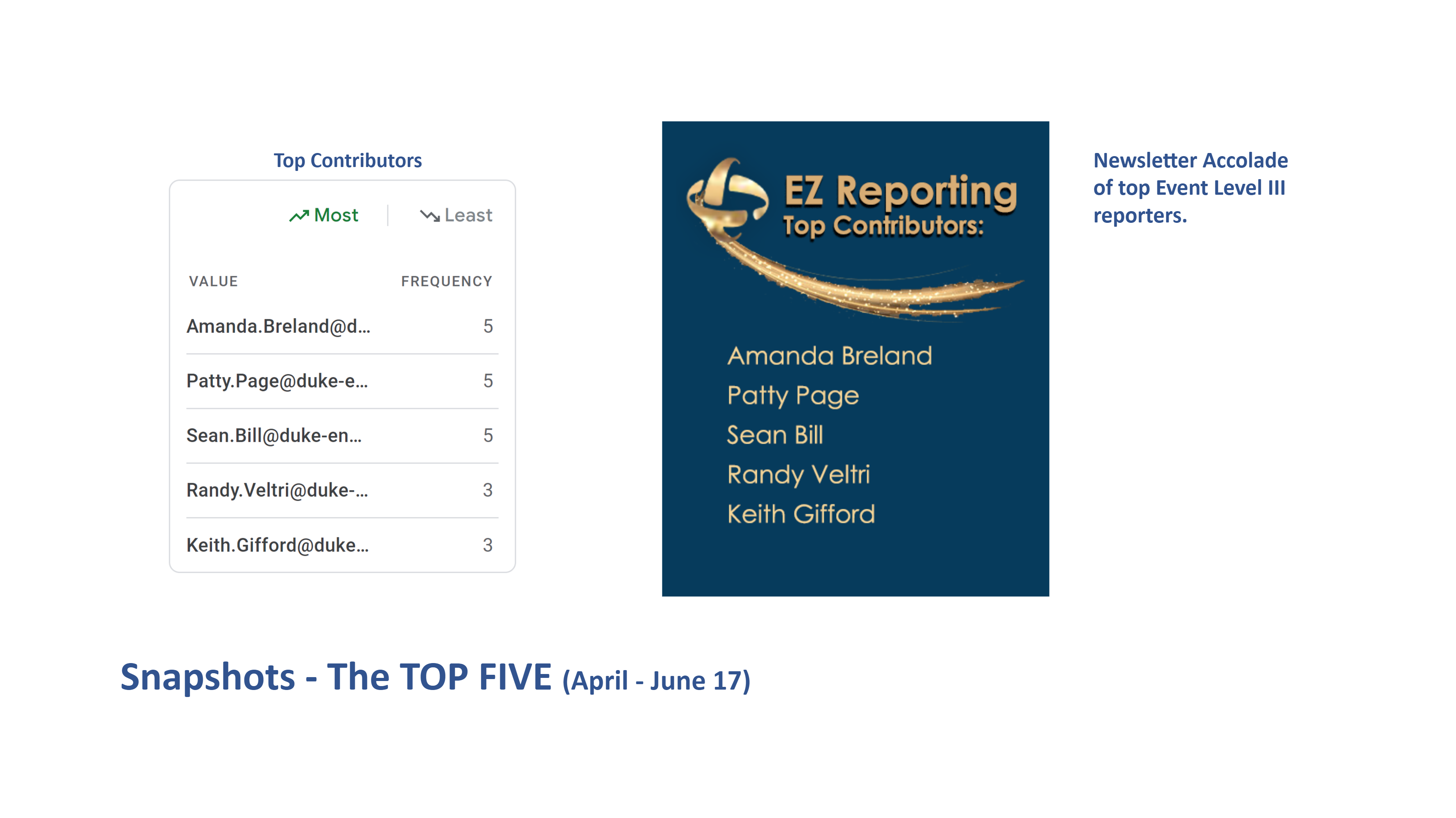
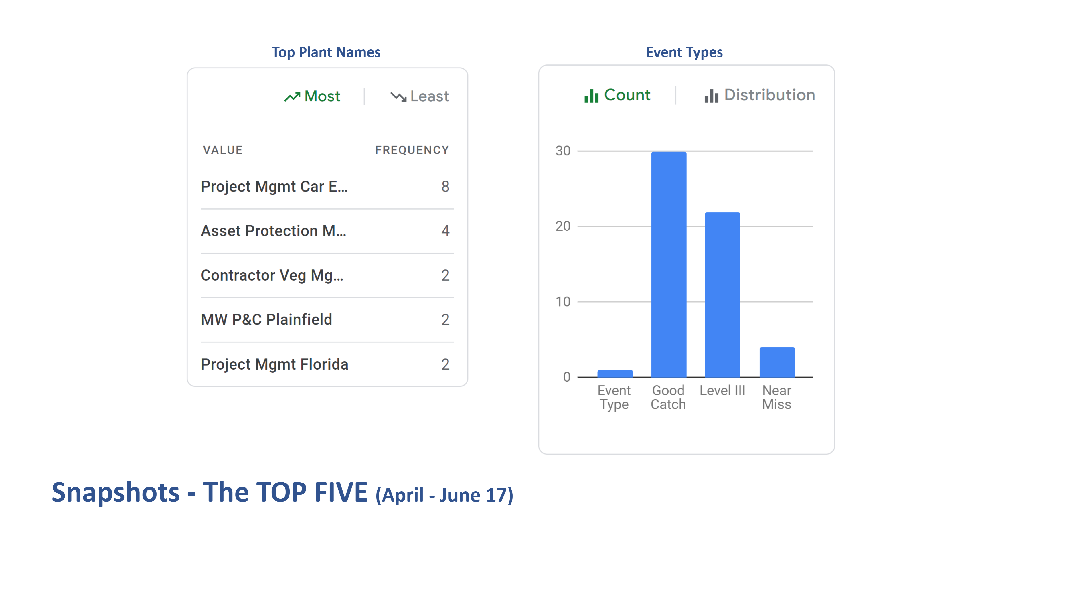
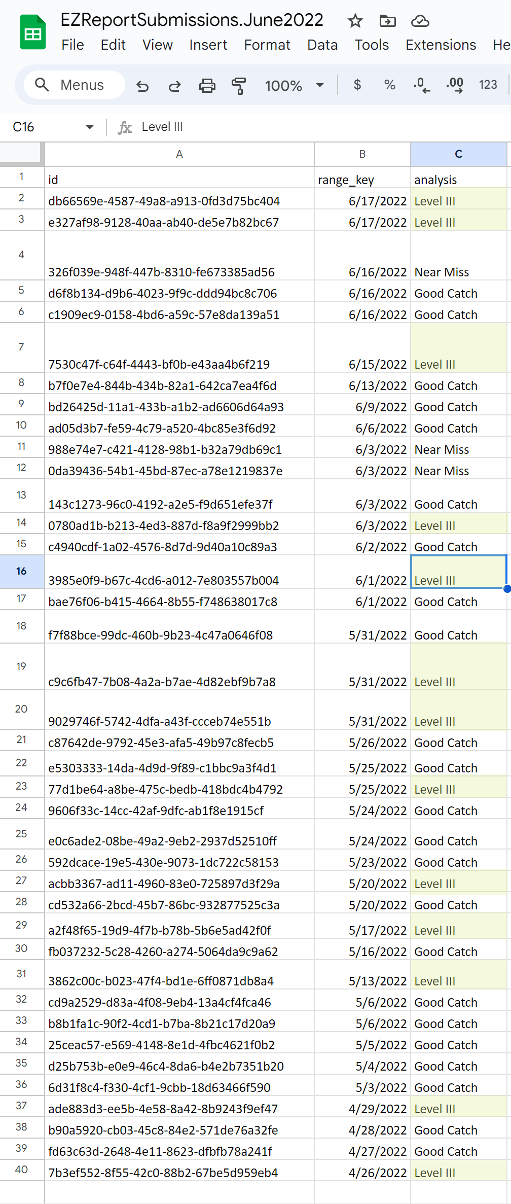
The updated Level 3 Reporting form resulted in a remarkable 300% increase in reporting. User feedback was overwhelmingly positive, with users expressing satisfaction. The business unit exhibited high levels of contentment and began discussing potential incentives and even competitions to further stimulate reporting.
