iGrid Visualization
Joining the iGrid Visualization team, I assumed the role of the lead UX/UI designer with a mandate to establish a design standard for Duke Energy’s suite of planning and forecasting products, aiming to enhance power delivery efficiency, cost-effectiveness, and reliability. Tasked with conducting user research, devising a comprehensive design strategy, and assisting individual tool teams with their MVP products, I navigated the challenges of working in an energy utility company serving six US states (North Carolina, South Carolina, Florida). This experience not only enriched my knowledge but also allowed me to educate stakeholders on user research and UI/UX methodologies. Collaborating with IT managers, product owners, and engineers, I played a key role in clarifying the requirements for the standardization of iGrid Visualization.
iGrid VISUALIZATION STANDARDIZATION GOALS
Visual Design Language
- Aesthetic Identity (color palette, branding, differentiation)
- User Interface Structure (ergonomics, methods, wizards)
- User-Friendly Processes (scalability)
Tools
- Data Visualization (maps, charts, dashboards)
- UI Assets (material library)
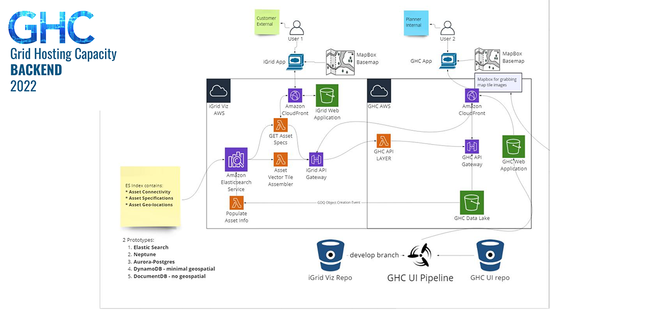
- Backend Infrastructure (node, json, etc)
- Proof of Concepts (Research, MVPs)
- Advantages for End Users
End User Benefits
- Reduced training requirements
- Accelerated delivery speed
- Faster time to Market
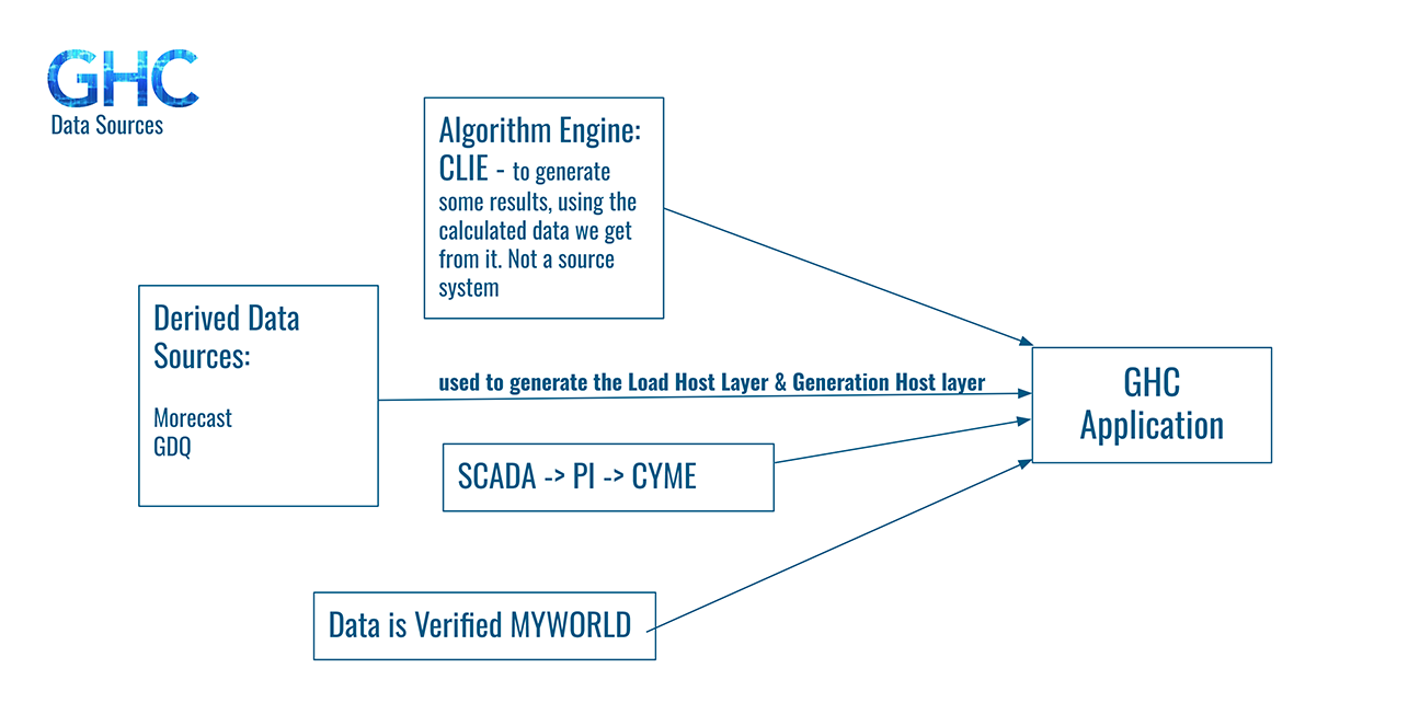
I proactively engaged in extensive questioning as I familiarized myself with an unfamiliar industry. My onboarding strategy involved building connections with my immediate collaborators, engineering leads, as well as key leadership and decision-makers. Over the past few years, I observed the simultaneous development of various products for data solutions, distribution planning, and grid analytics, each group unaware of the others’ initiatives. Recognizing that all these products functioned within a shared ecosystem and accessed the same repositories of raw data, I compiled a comprehensive list of all iGrid products along with their respective mission goals for the benefit of both my colleagues and myself.
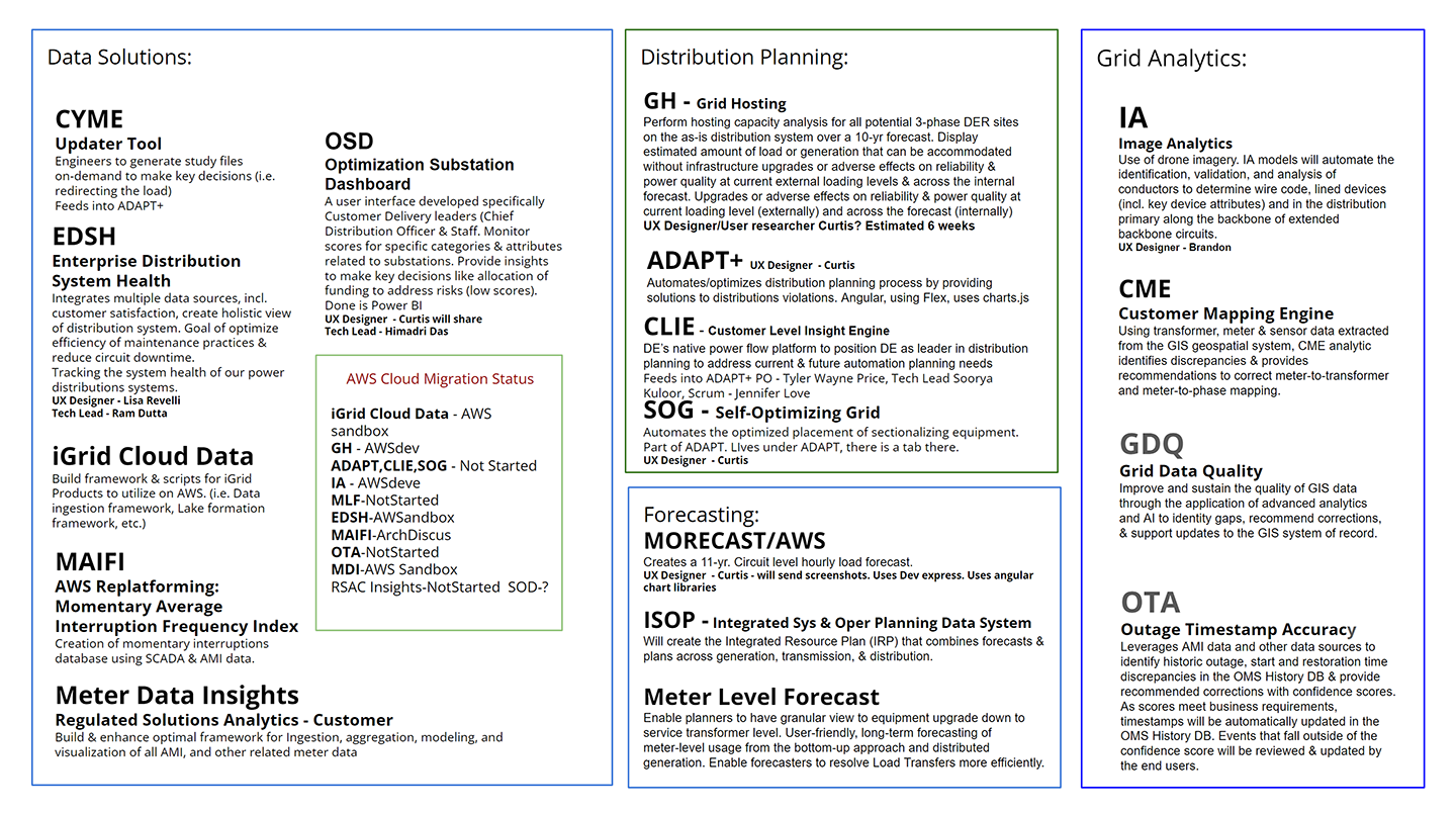
Content Survey
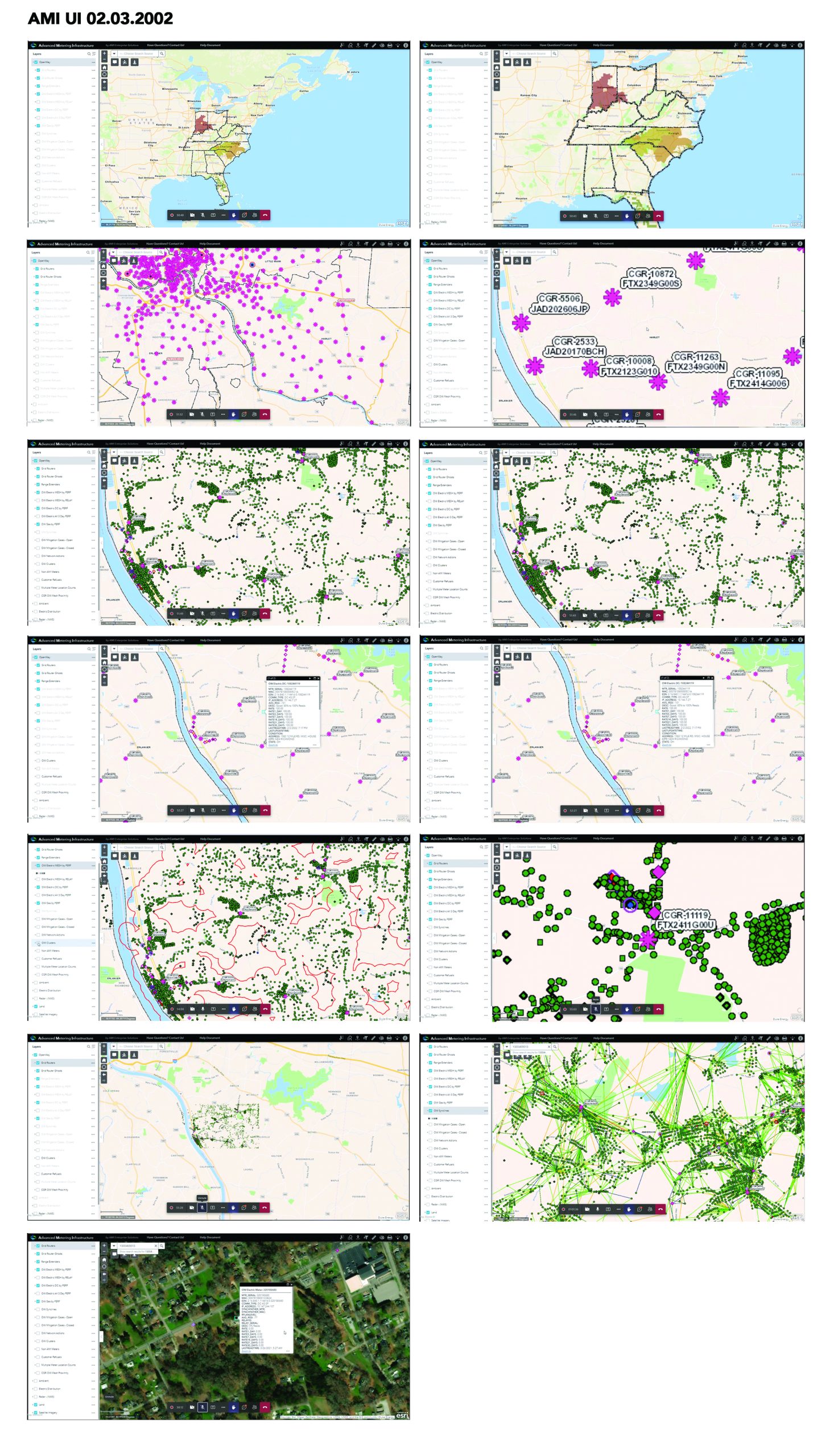
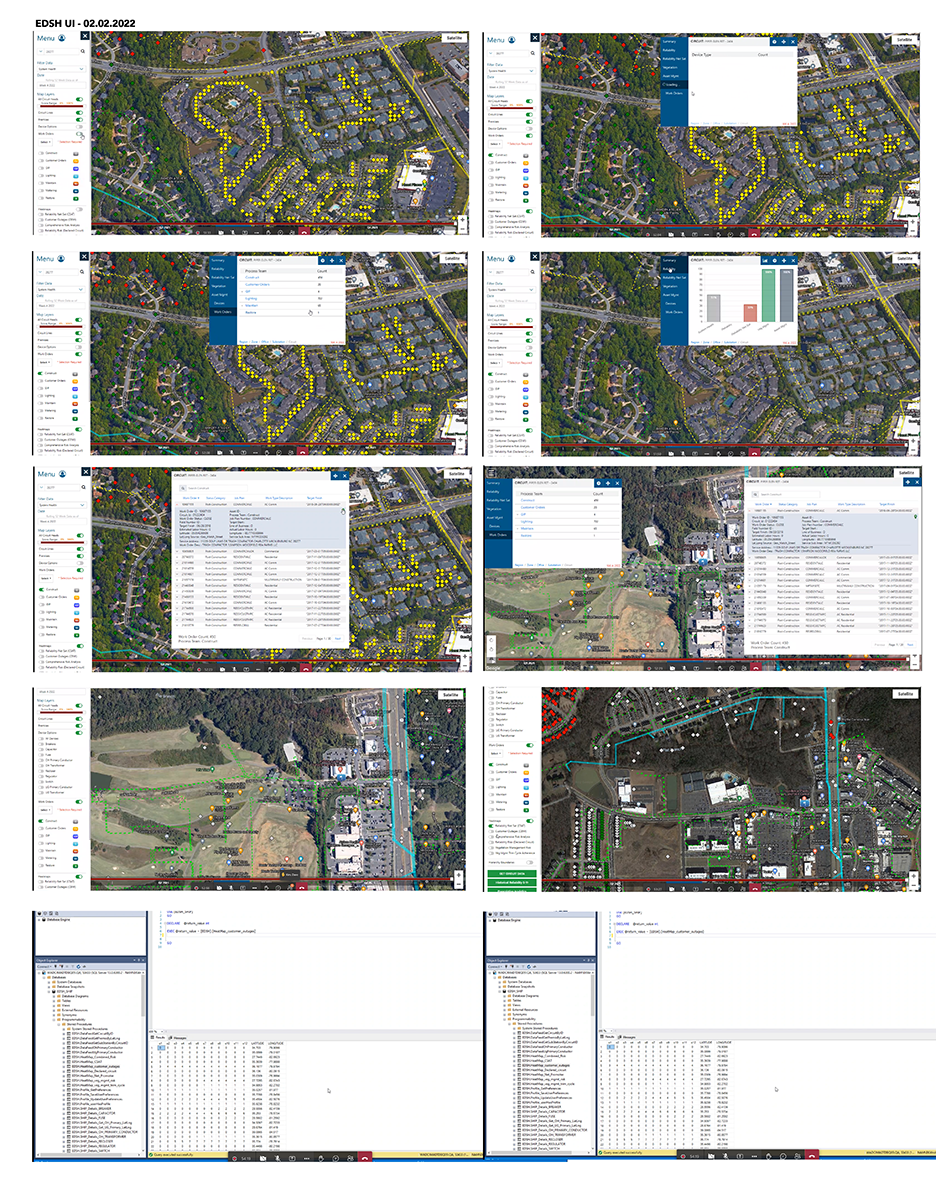
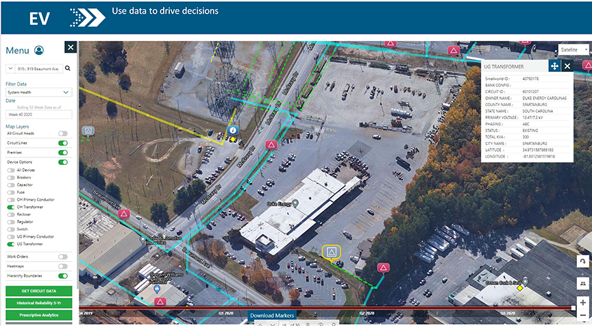
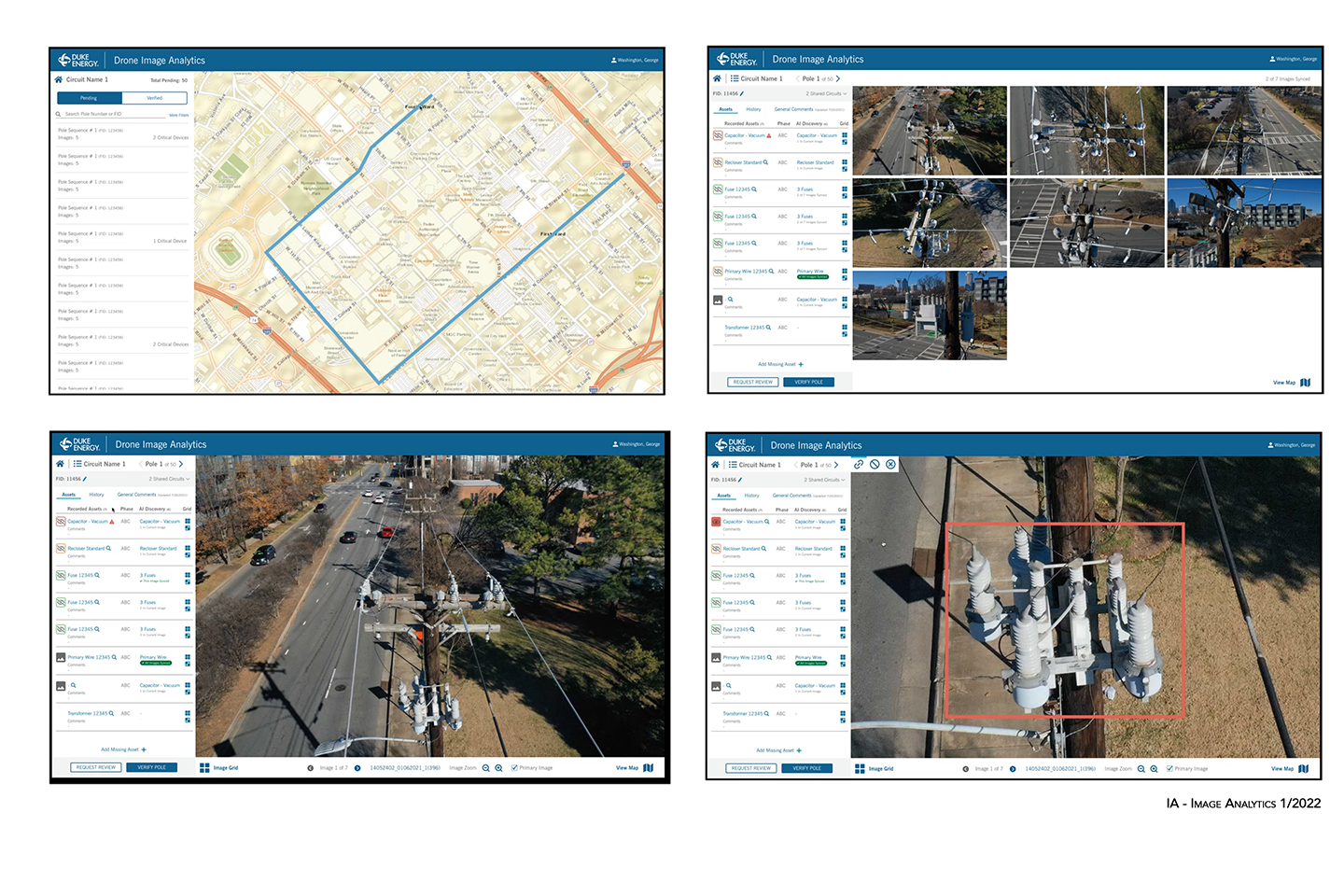
Each product already had its own interaction design from which I needed to see commonalities and differences in user experience and user interfaces. As I surveyed each product, the multitude of computing interfaces overwhelmed me, highlighting the evident need for design standardization. Considering the end users—ranging from planners and forecasters to customers—it was evident that the lack of a consistent visual language across tools could pose a significant barrier to adoption. While the UX/UI were predominantly functional, they lacked intuitiveness, a consequence of being primarily engineered in design. Addressing this, I had to devise a diplomatic strategy to aesthetically enhance the UIs of the products and transition them to a unified look and feel, all while navigating the pride developers had in their respective tools.
Contextual Interviews
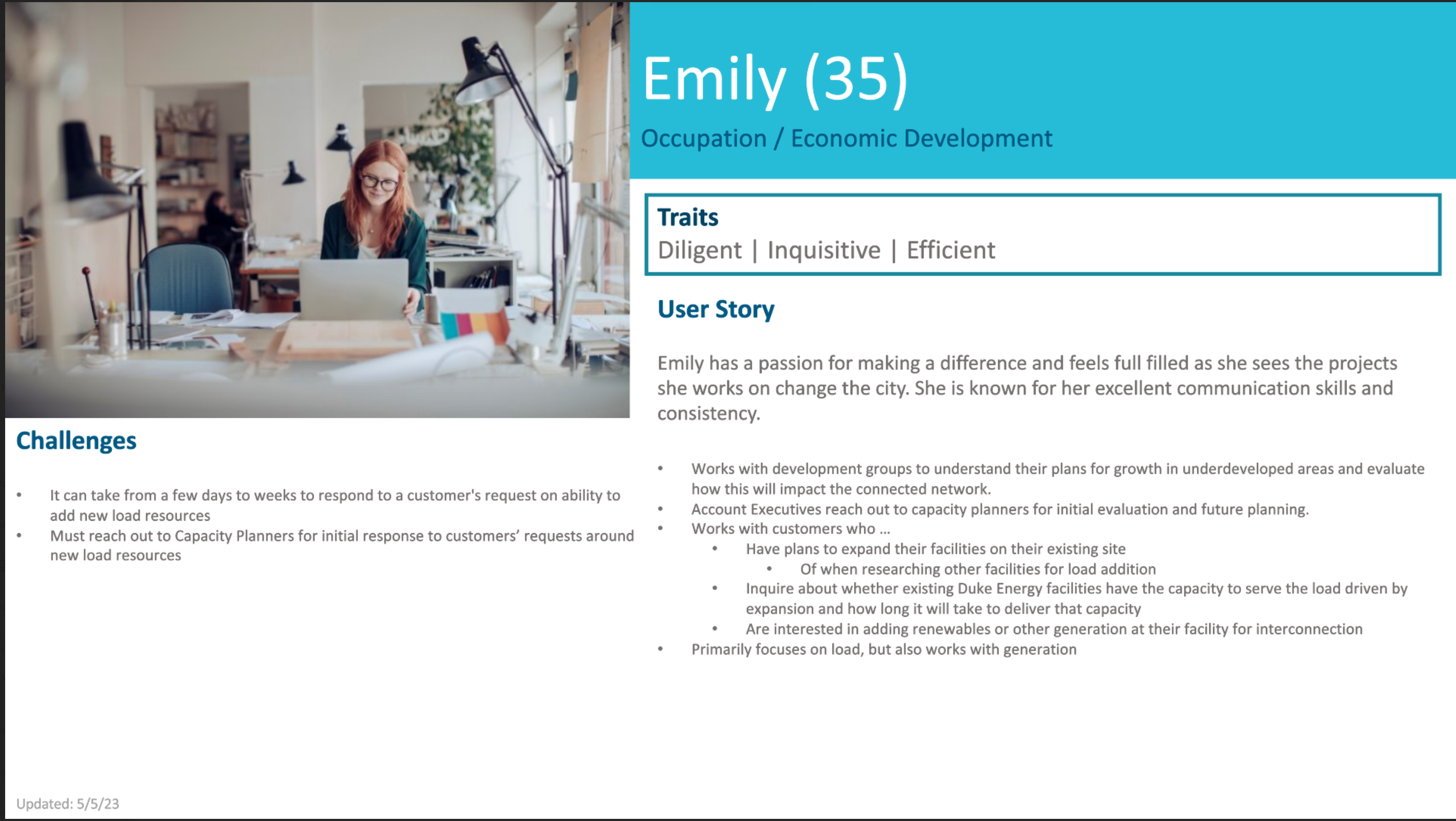
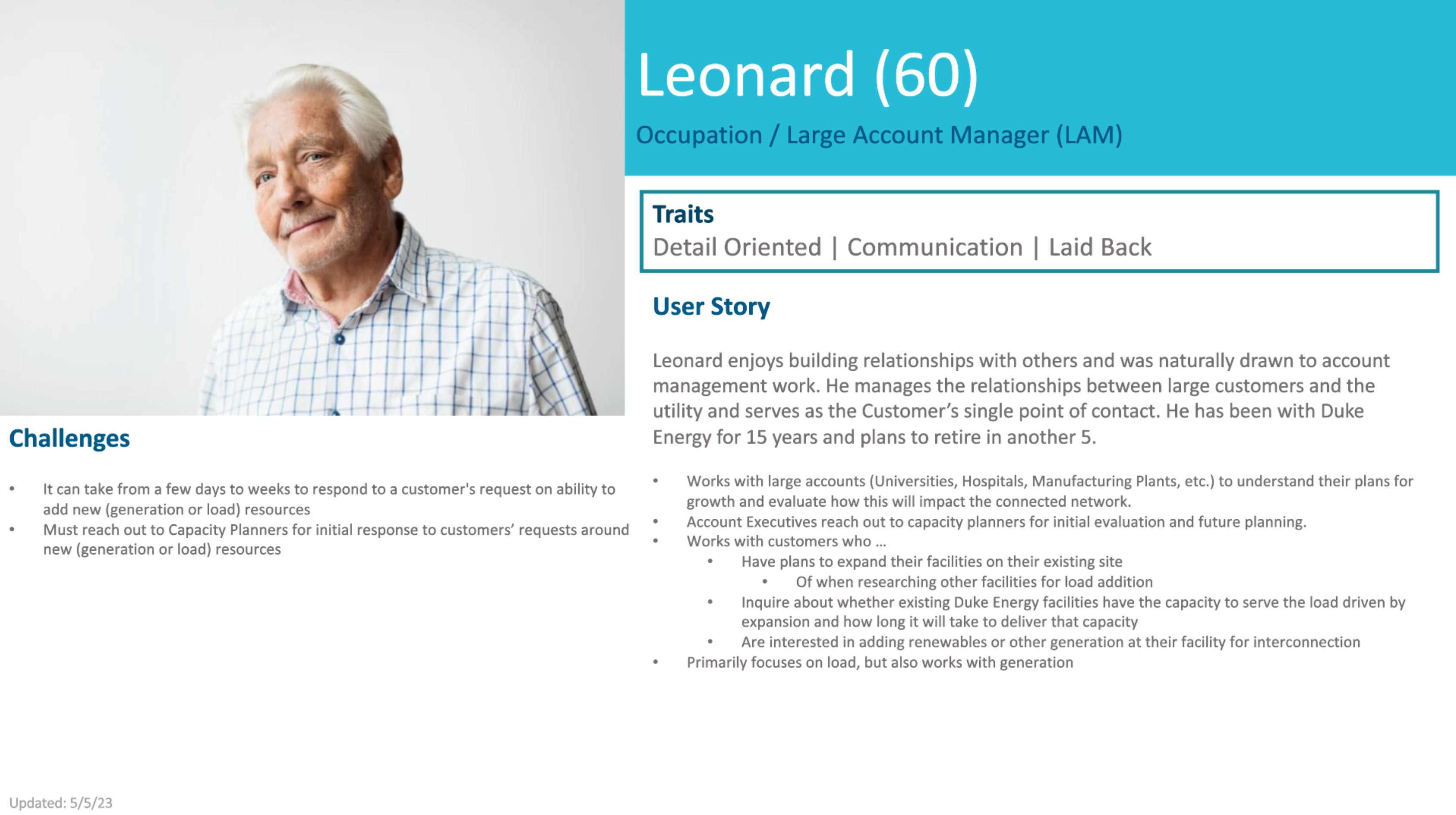
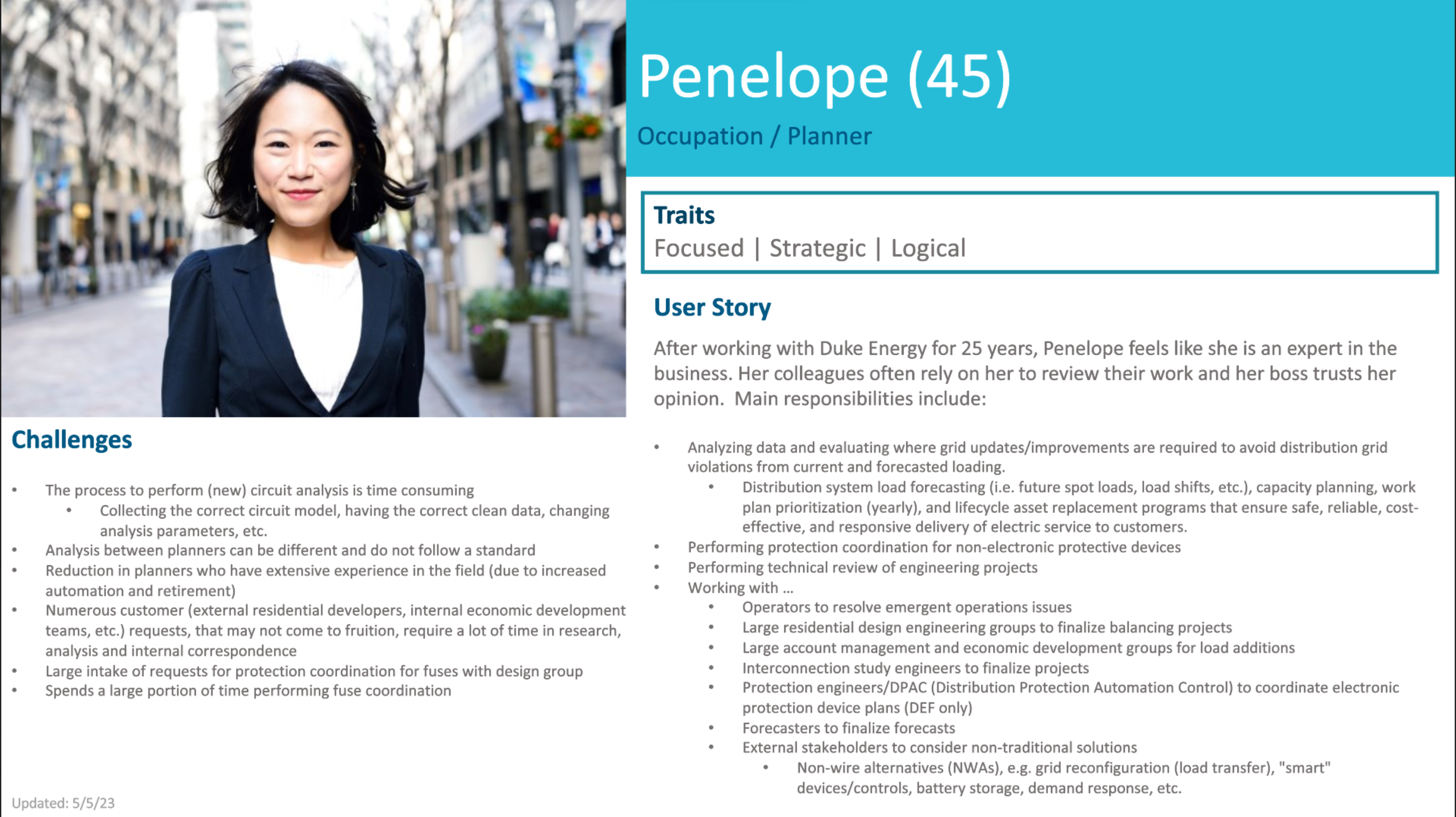
The individuals I interviewed initially began their careers as engineers and transitioned into diverse roles, including forecasters, planners, design engineers, economic developers, and large account managers throughout their tenure at Duke Energy. The range of their experience varied, spanning from 2 years to individuals aged 60.


DESIGN PHASE
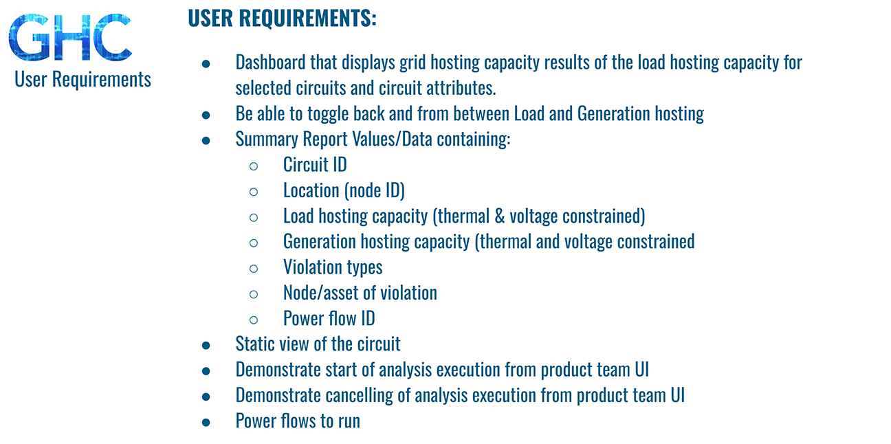
In collaboration with the product owner and lead engineer, I meticulously outlined the property asset data and prioritized its presentation based on the user’s sequential tasks. Their primary objective was to guarantee the ready availability of data, and they initially advocated for displaying the same data in multiple locations on the map. I successfully persuaded them that adopting a singular path to access the desired data would be the most efficient and less confusing approach.
User Experience
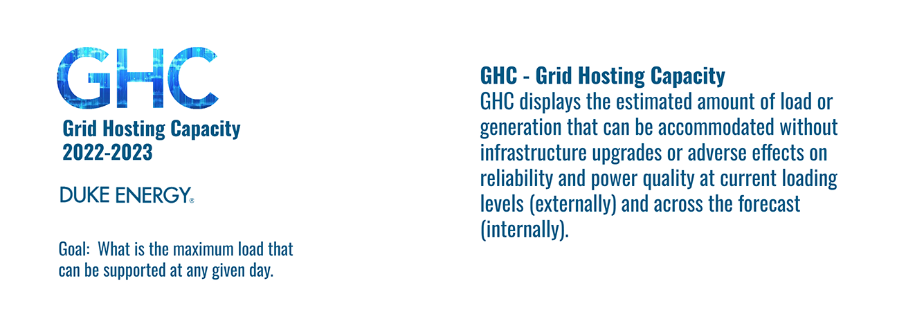
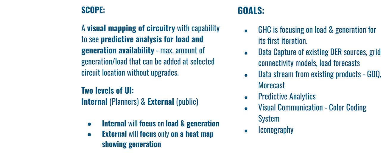
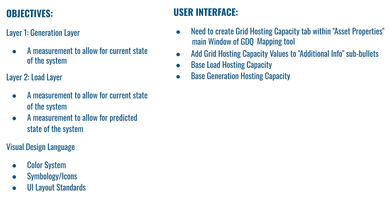
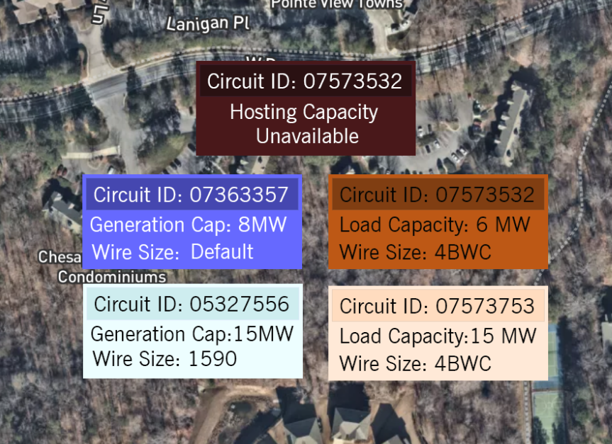
Grid Hosting Capacity (GHC) posed two challenges that needed to be addressed for an efficient and precise user experience. The first challenge involved engineers or planners swiftly accessing a wealth of detailed real-time data depending on the specific project or task at hand. The second challenge required users to pinpoint more relevant data on a map for accurate analysis and summarization into a report.
Through numerous contextual interviews with Senior planners, engineers, economic developers, and large account managers, I reaffirmed a crucial realization. The interface had to communicate on multiple levels to cater to diverse requests, yet maintain simplicity and intuitiveness for easy navigation.


User Interface
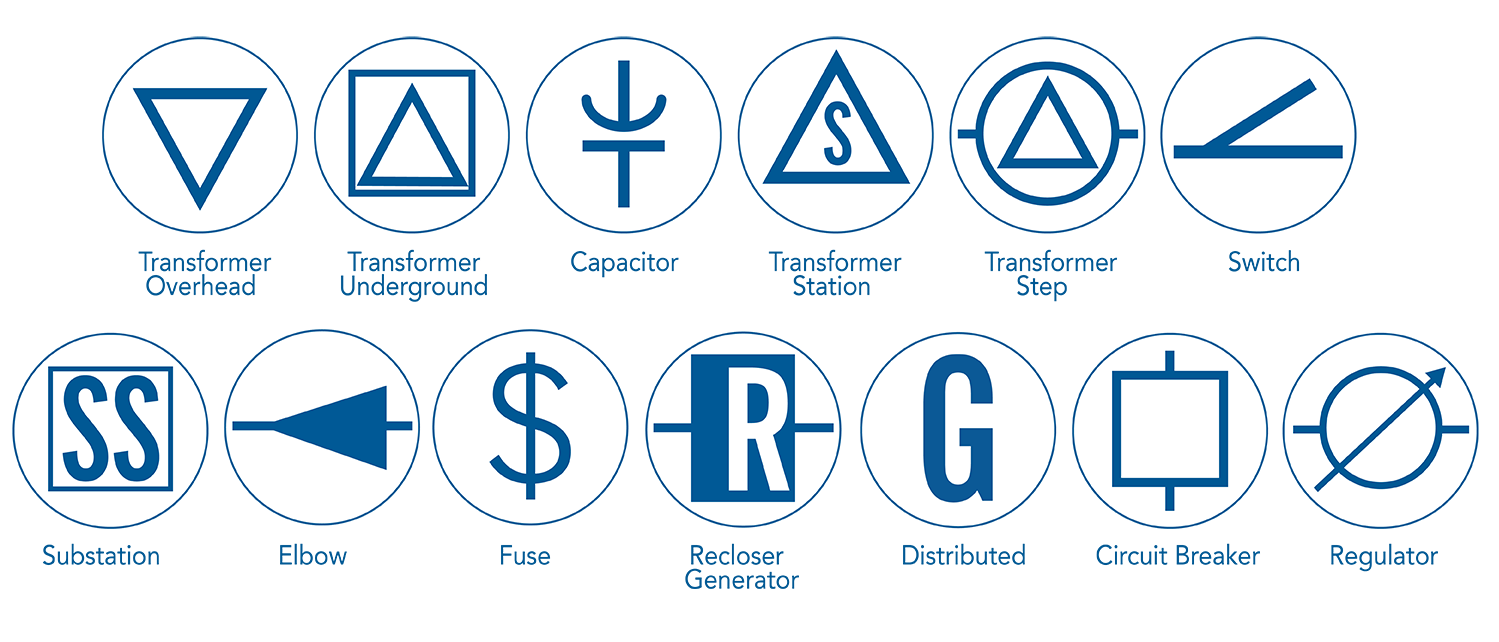
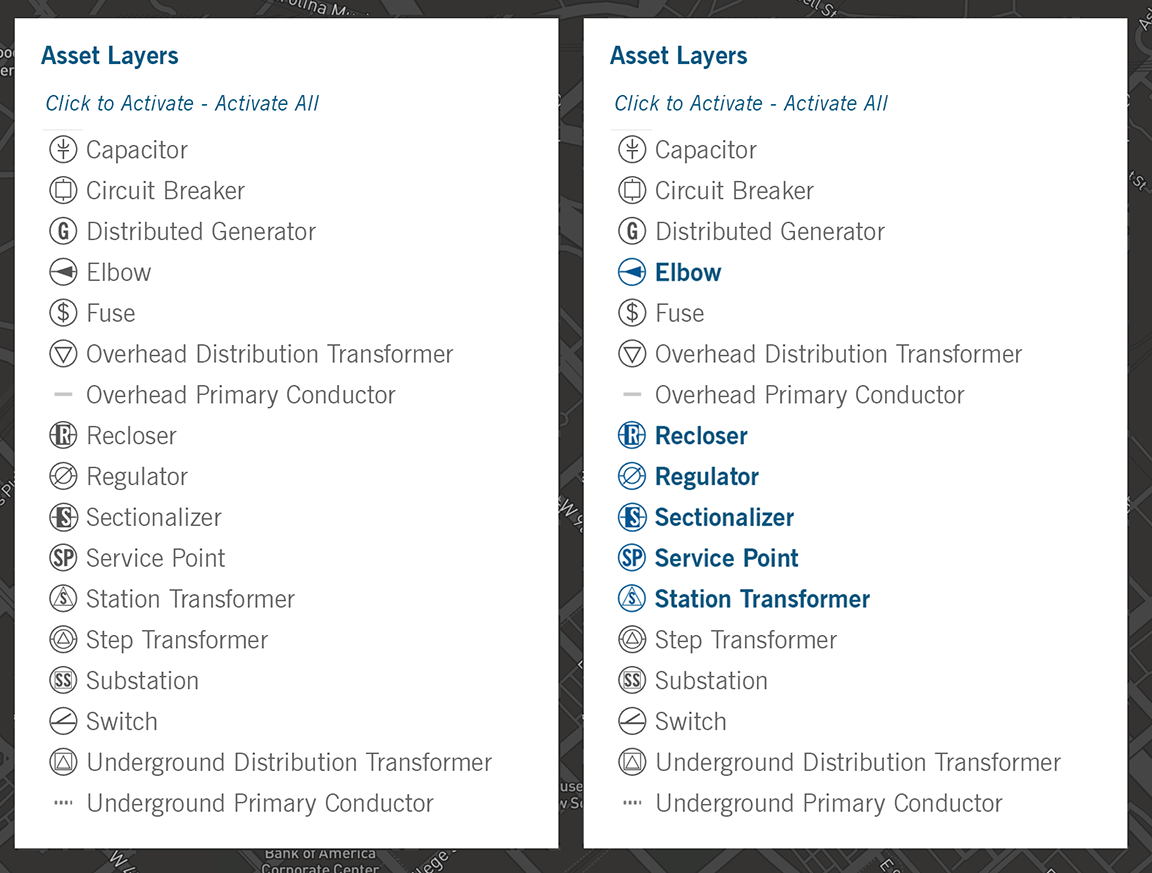
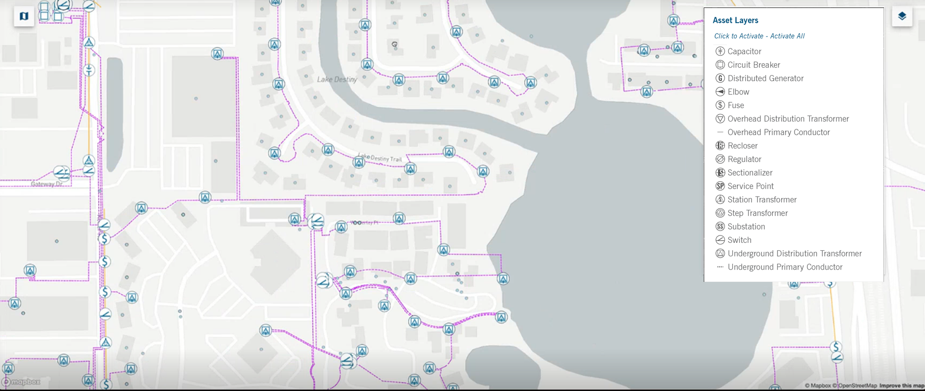
The symbols representing electrical and circuitry entities were absent from Duke Energy’s electron library. Despite consulting engineers, planners, product owners, and other designers in my interviews, a comprehensive list of easily recognizable symbols for interface users proved elusive. Subsequent extensive research led me to create representative symbols capturing the essence of the entities, ensuring recognition by users. Following thorough testing, these symbols were established as the GHC standard and incorporated into Duke Energy’s electron library.
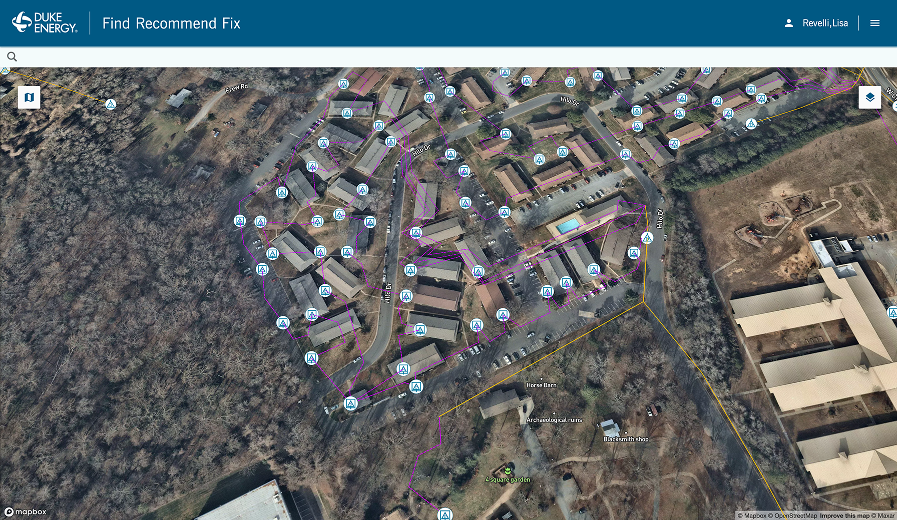
Integrating the symbols along circuit lines on a map posed a unique challenge. Maintaining a harmonious balance of data graphics on a potentially visually busy map was consistently challenging.
